
THE BRIEF
To rebrand a New York deli style eatery in Sandton City, Johannesburg.
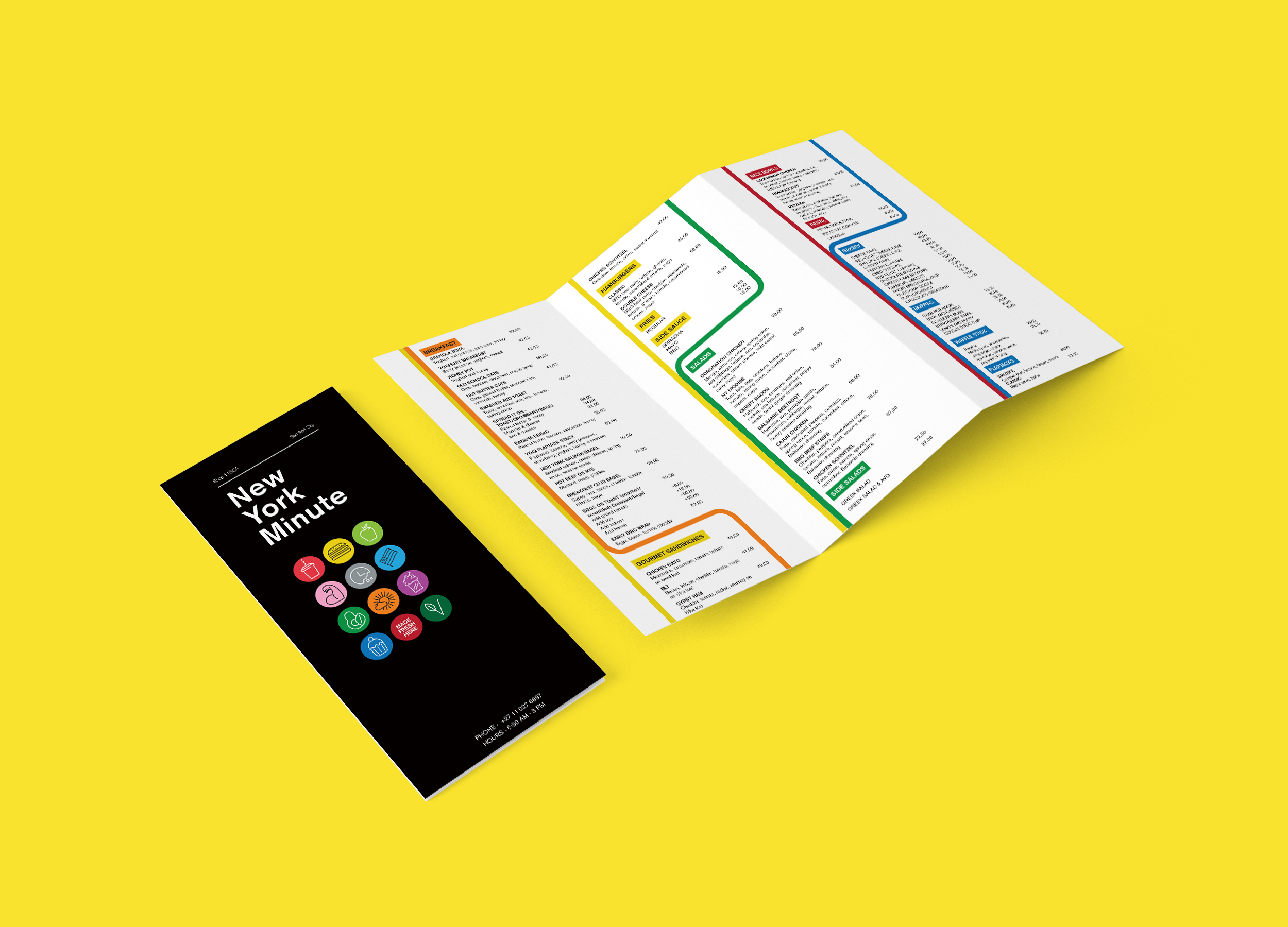
THE THought
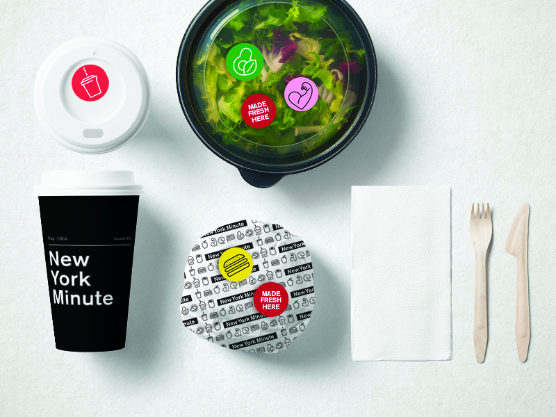
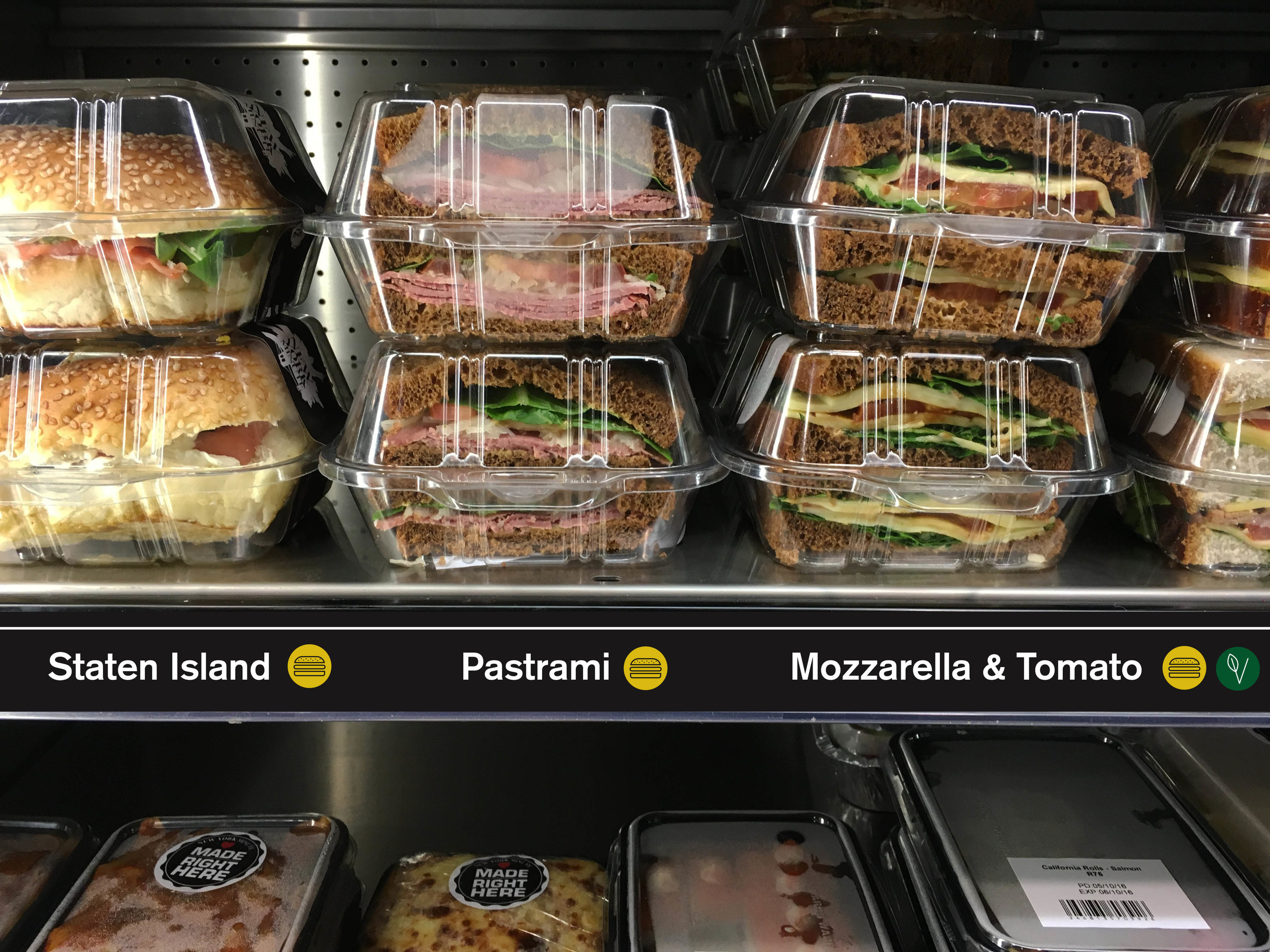
For the rebrand we were inspired by the iconic New York subway. For the logo we used the same font the subway signage system has utilised since the 1960s. We also designed an icon set as a means to illustrate the different food and product categories. The menu was also designed to look like the map of the subway.
TAGS
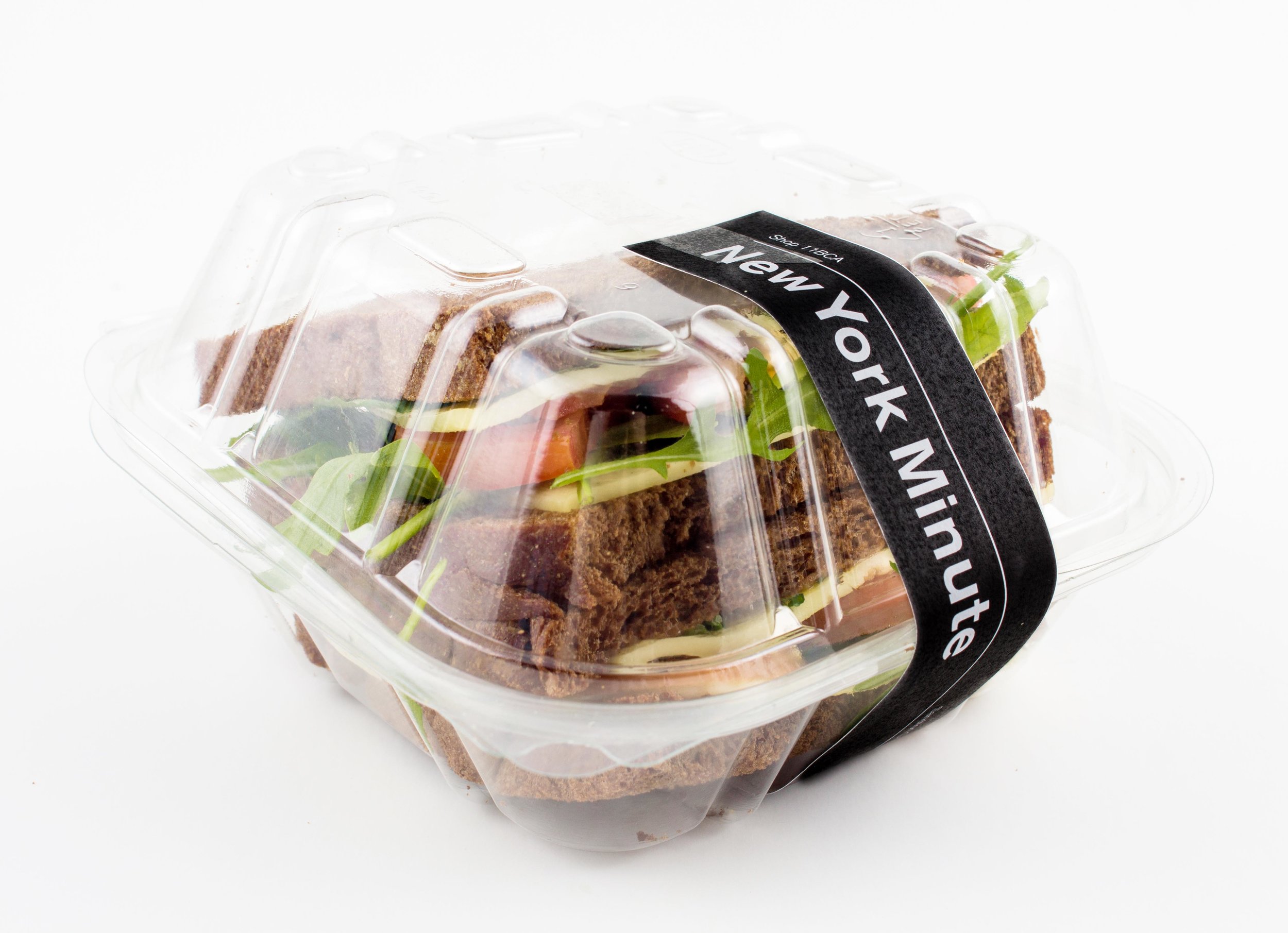
LOGO, CORPORATE IDENTITY, MENU, PACKAGING, SIGNAGE