
THE BRIEF
We were approached by our client to rebrand Home & Catering Suppliers and give them an updated, contemporary logo and look and feel.
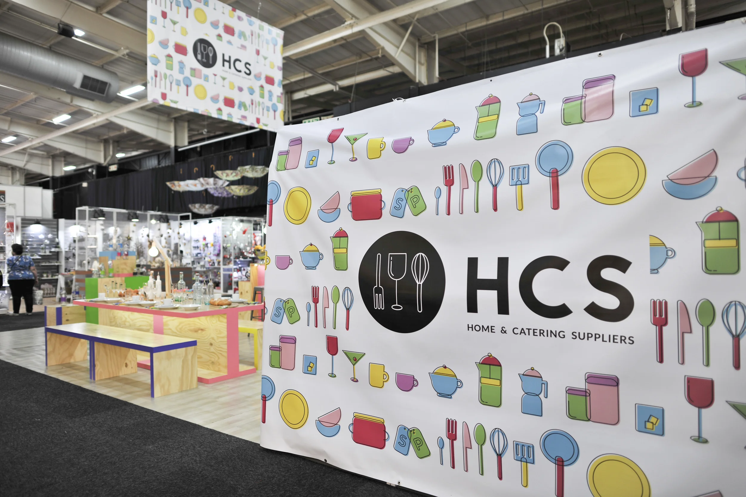
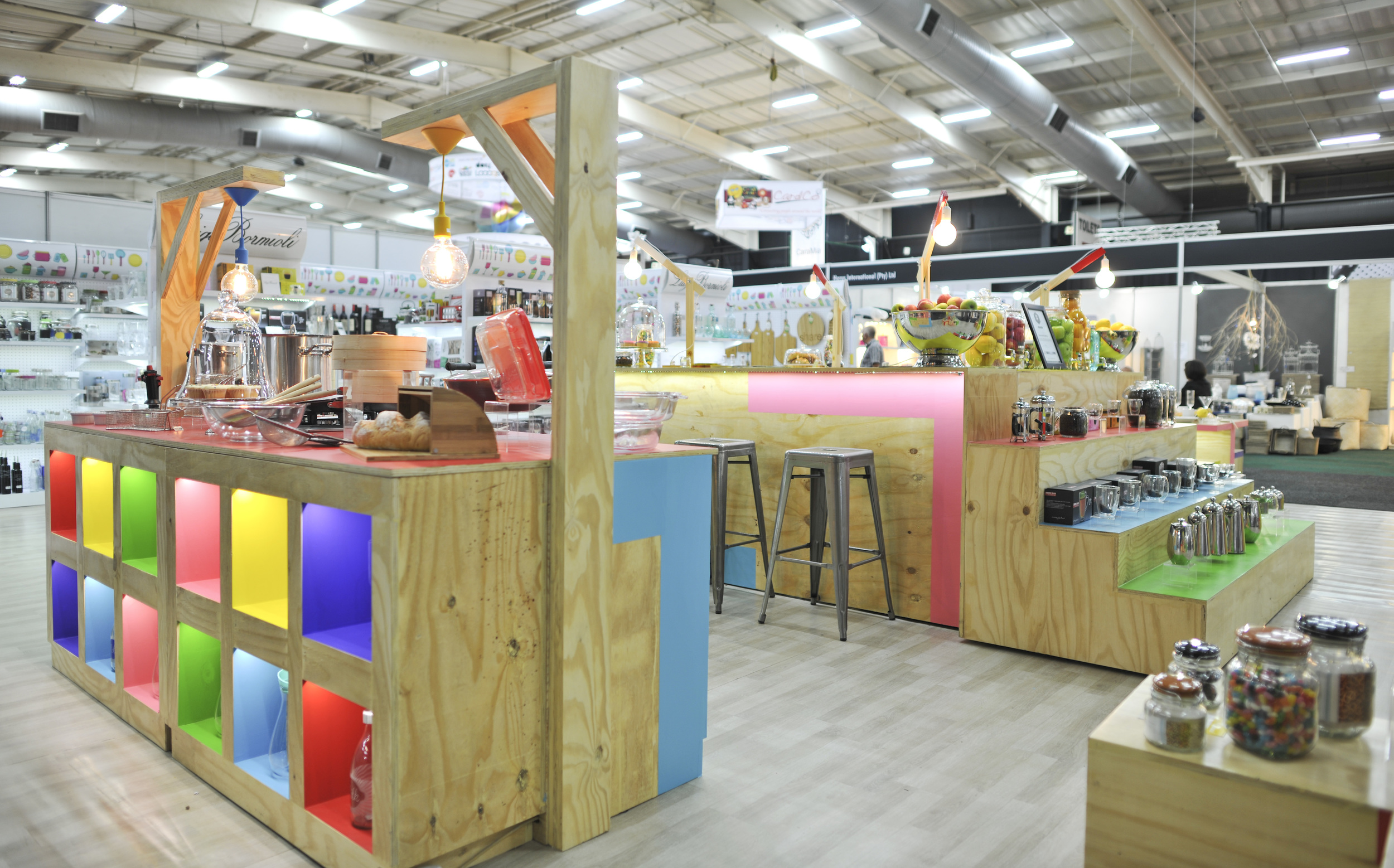
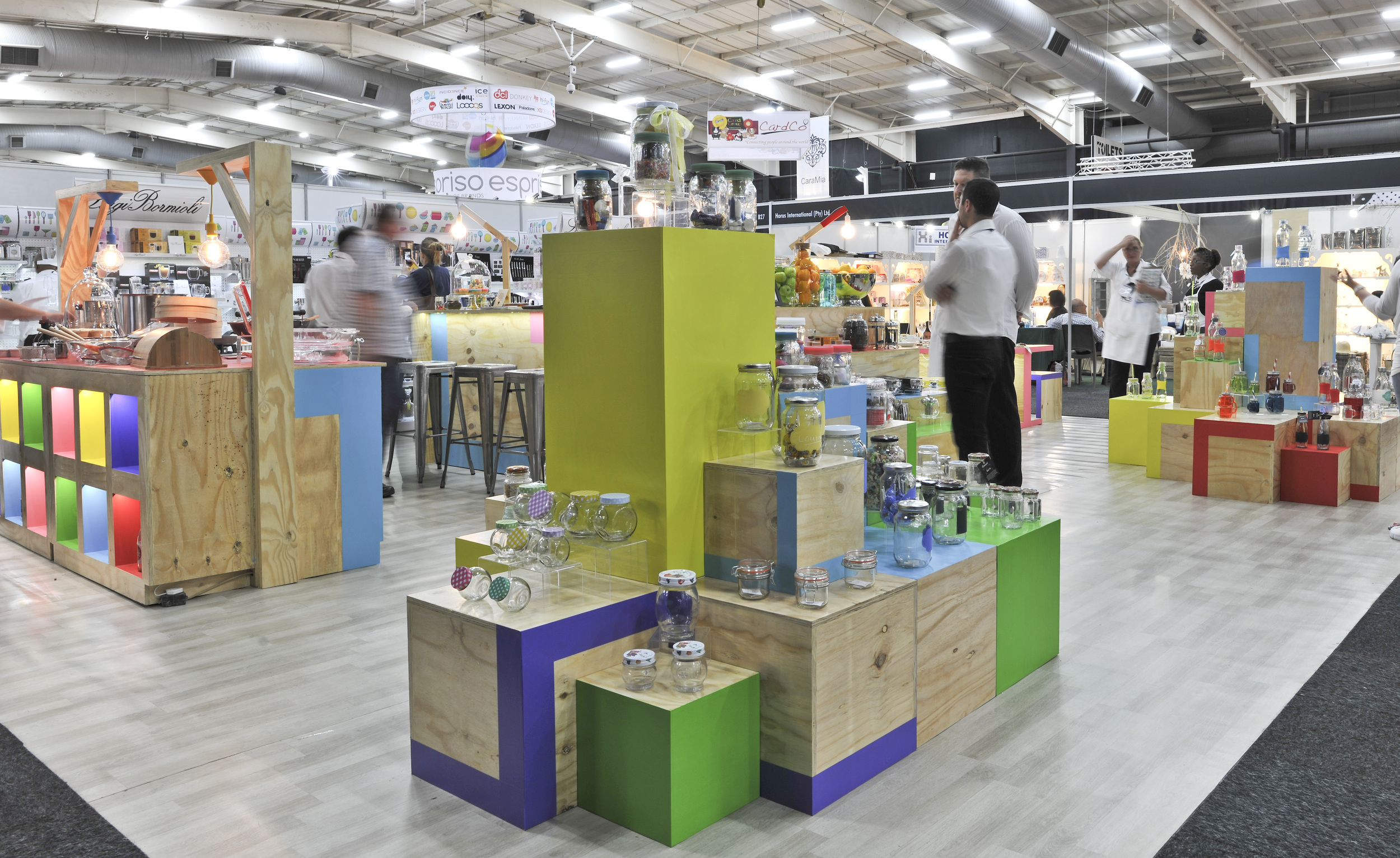
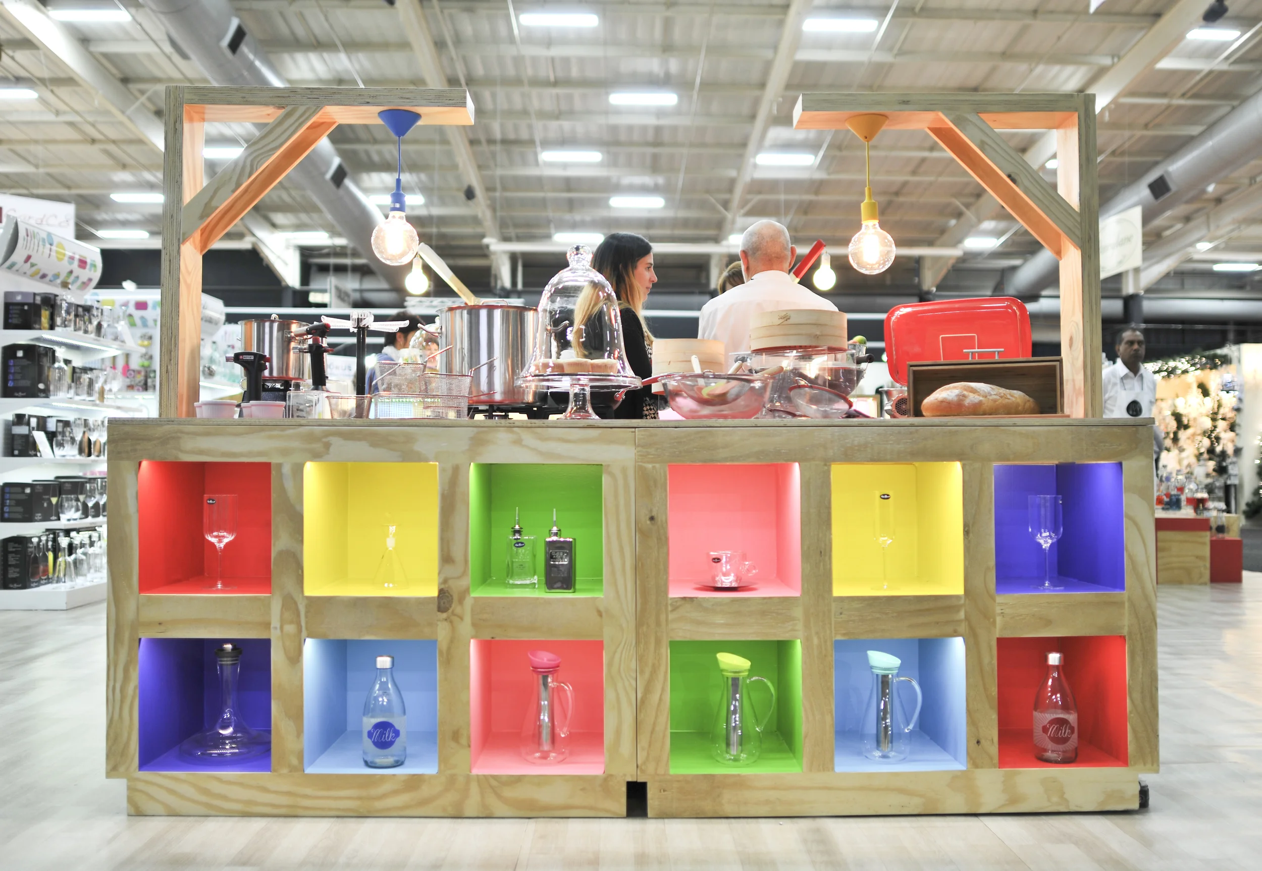
We were also asked to create an expo stand from which to launch the new identity to the market.
THE THOUGHT
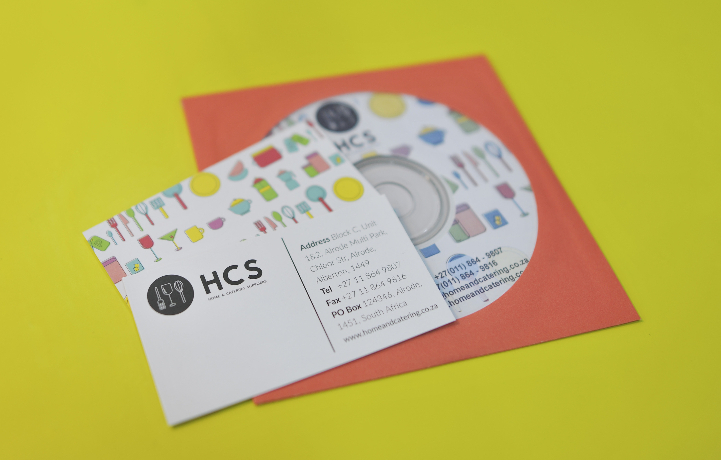
For the logo we wanted to highlight the three main properties of the products - eating (fork), drinking (glass) and making (whisk). We kept the logo colours monotone as to not distract from the various sub brands and products within the HCS catalogue .
Along with the logo we created a set of icons to represent the client's various home and catering products. We used this eye catching illustration across the branding as well as a means to categorise and colour code the different products.
Finally keeping in line with the identity design we had bespoke display units made for the industry expo and to launch the new branding.
TAGS
LOGO, CORPORATE IDENTITY, PACKAGING, MERCHANDISING